

With the changing trends in interior design, people are attracted to a more minimalist style in their homes as they aspire to a more relaxing and stress-free environment. Unfortunately, online stores offer a wide range of furnishings to suit all interests, making access to this new style rather complicated. This is where Exquisite comes in, as a boutique that combines minimalism and elegance by selling supplies and objects for interior design.
Exquisite could engage new users, enabling them to rediscover a style that's uniquely theirs, while avoiding the frustration of having to shop for countless hours.
The project brief included many user stories and I had to choose 3 to 5 stories with their corresponding features. I ended up choosing the features and user stories that would fit more the target costumers I was aiming for:
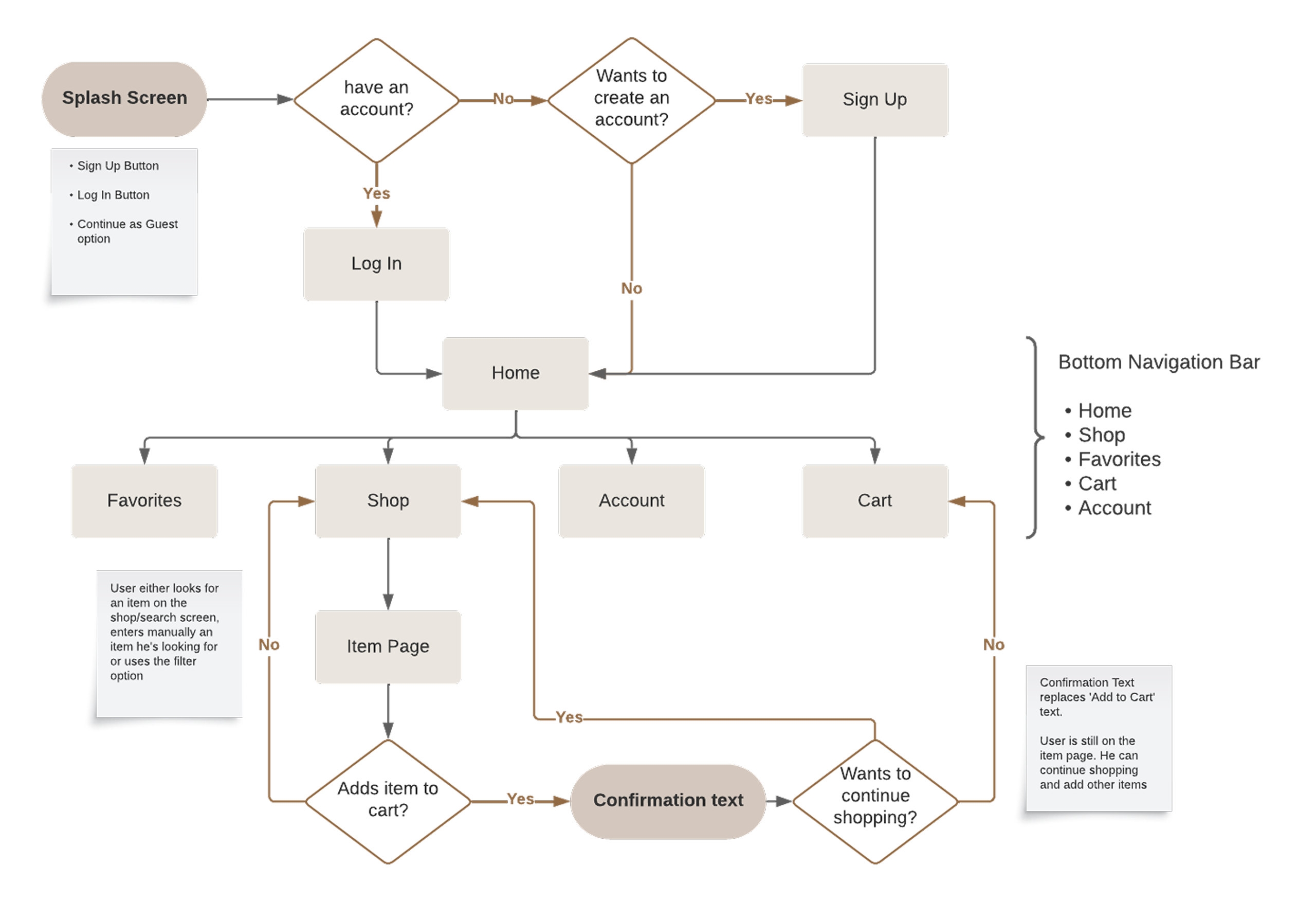
Following the user stories, I developed a user flow diagram whose main flow is the addition of an item to the shopping cart.
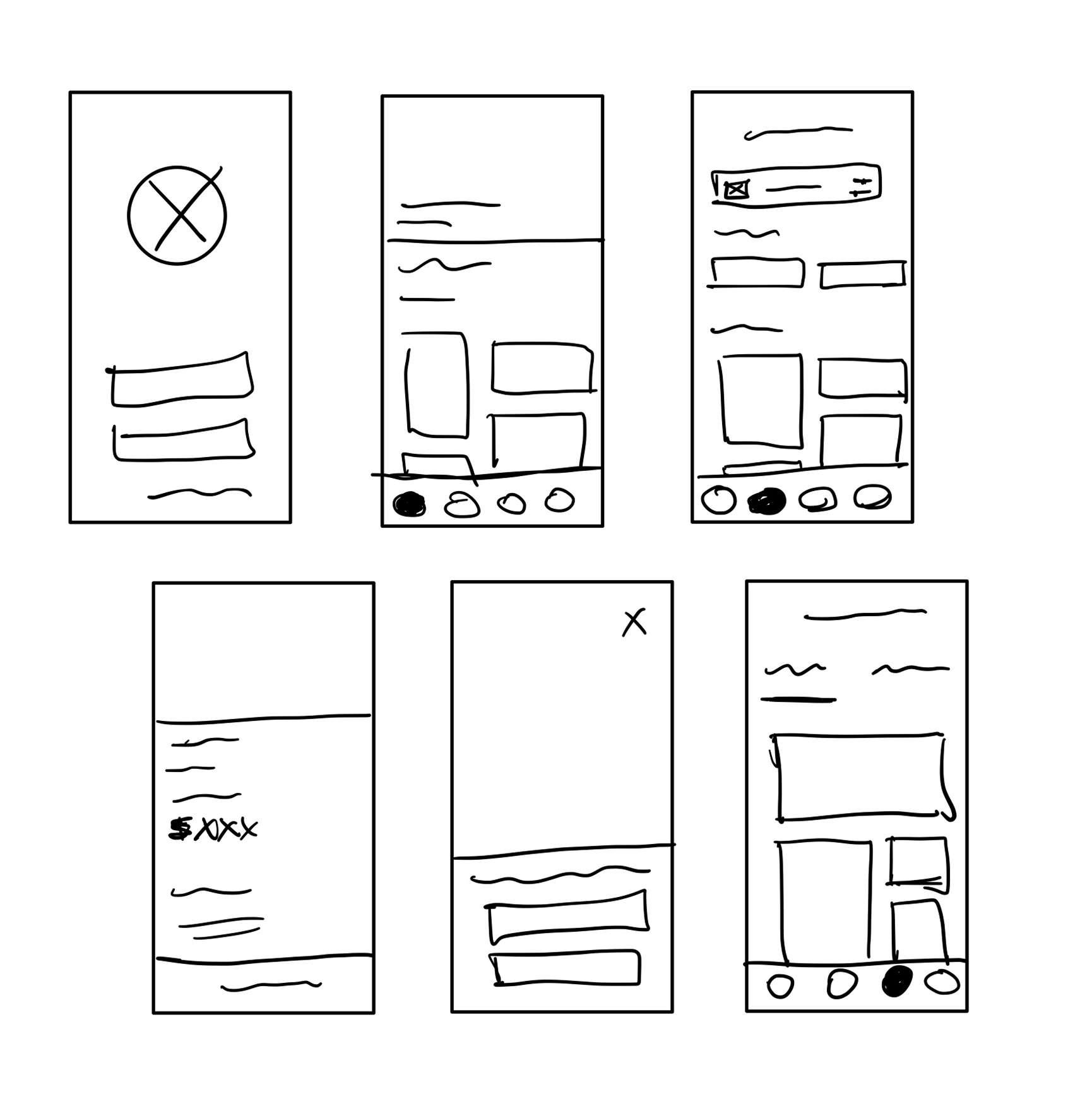
I then used the user flow diagram to sketch the initial screens of the app. The idea was really to go with very minimalistic screens and big pictures for the target customers. I also figured that would better suit the idea behind the brand of a luxury home decor app.
Before testing the sketches with users, I turned them into mid-fidelity wireframes and a semi-functional prototype :
So after making the mid-fidelity wireframes, I had four users test my prototype to get their feedback and see where I could improve my design before proceeding with the high-fidelity wireframes.To test the main flow of my app, I've prepared a scenario and assigned a task to the testers to perform:
“You are a new guest user and would like to add a new item from our bestsellers to your cart. Which steps would you take to accomplish this task?”
“ The steps were quite quick and easy to follow and I liked the dynamic shapes on the shop section. It really gives a sense of motion without disregarding too much the "static nature" of the app. Maybe I'd remove the "we got you covered" text as the "bestsellers" caption already sells the purpose of the section “
"I’m not used to being asked to ‘Continue as a Guest’ when I land on the page. I expect to see it the moment I proceed to checkout “
“ The app has a nice flow, it’s easy to use and looks great. As a suggestion, you could maybe add an icon to add an item directly to your cart (next to the like icon) so you don’t have to look into the details “
“ The shop screen has a really nice layout, inciting a horizontal and vertical scroll. Spacing feels just right. I'd also increase a tad the text size on the item description. Product page also feels very nice, nice use of negative space; Overall, the flow was easy and intuitive. No problem to get there. I lost some seconds looking immediately for an item on the home screen. Clean designs, love it! “
So I got really nice feedback from the user testing. In general, the testers thought it was very intuitive and user friendly. Some of the confusion came from the fact that this was a mid-fidelity prototype. But I also took into consideration some of the points made and tweaked my design:
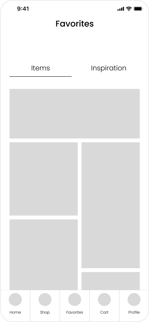
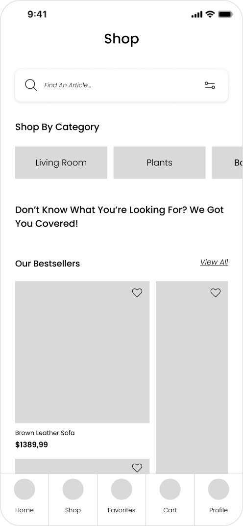
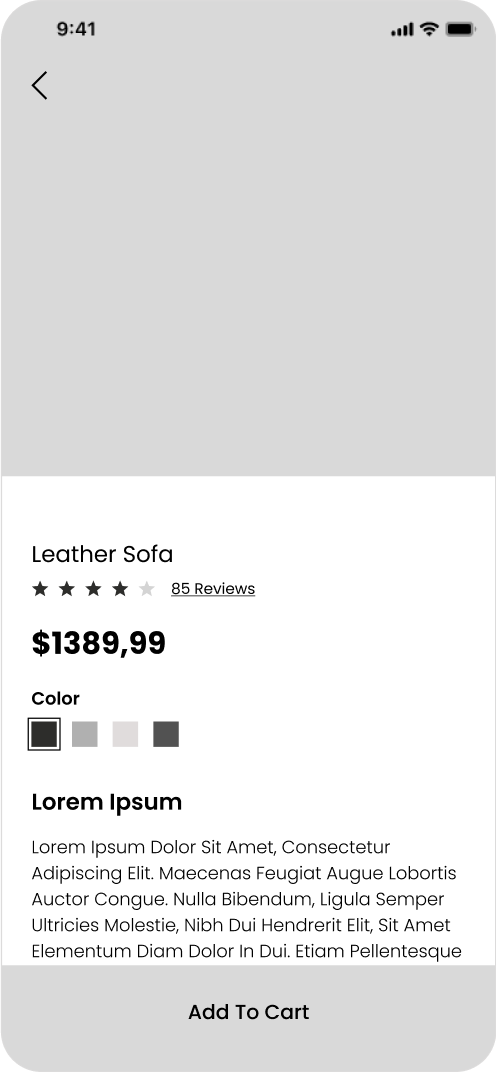
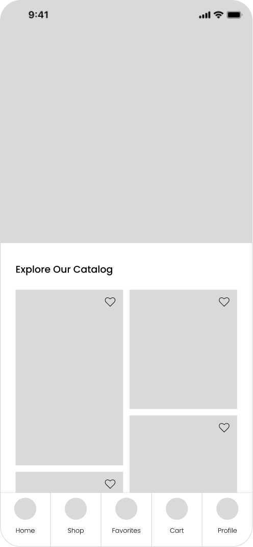
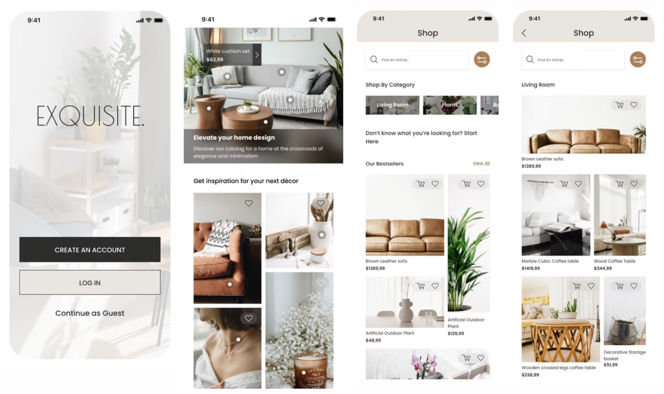
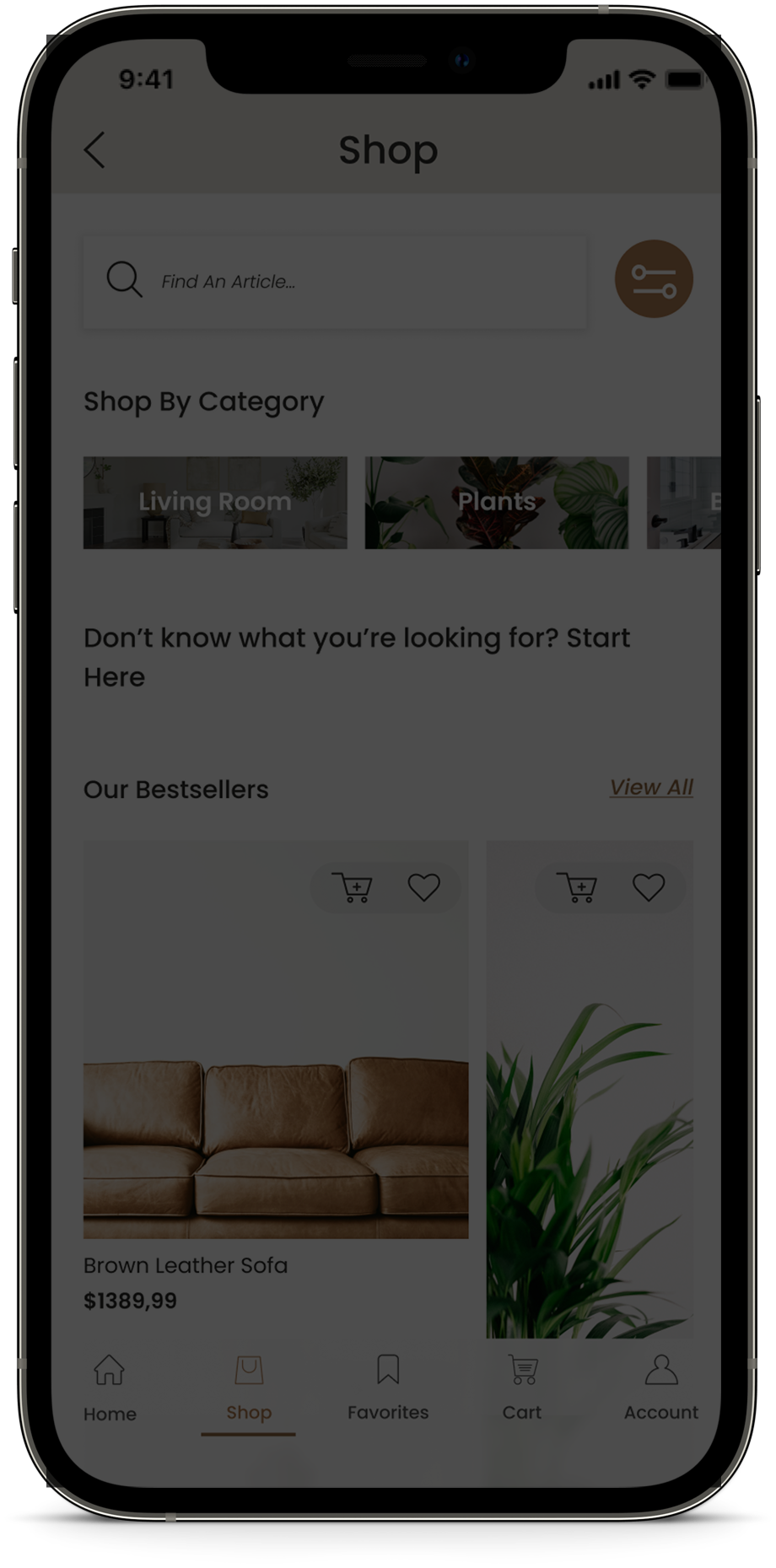
I reviewed my design from the user testing and designed the final screens for my Home Decor App. Here are a few screens of the final design:
This project also involved developing brand guidelines presented below :
Elegance is timeless and minimalism is very much in vogue. Therefore, Exquisite is the go-to store for everything you need to elevate your home's design and give it that chic, classy factor. And because elegance starts with oneself, the boutique offers accessories and jewelry to enhance your style.
Below are detailed the standards and guidelines for proper use of the brand including guiding principles, logo, color palette, typography, image style and writing style.
At Exquisite, we put elegance and minimalism at the heart of our products. We know that calm and well-being is a priority for our customers, which is why we design items to help our customers achieve the ideal of a visually appealing and stress-free environment.
For this reason, our core values include:
Wellness: from the first contact, we want users to feel serene, as if the platform reflects a deep relaxation.
Simplicity: we believe that minimalism inspires a stress-free and calm environment.
Elegance: because we believe that it never goes out of style, elegance is the keyword of our platform.
This logo is to be used on the website or/and app depending if it is a light or dark background.
This logo is to be used as the app icon on mobile phones or when space is limited.
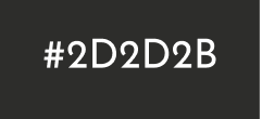
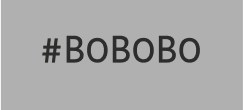
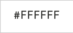
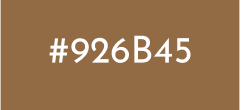
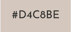
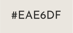
Because we aim for a minimalist and elegant style, our palette is essentially monochromatic..
Because we aim for a minimalist and eleAs stated in our values, we stand where elegance meets simplicity and this is totally reflected in the fonts we use. We have made sure that the fonts we utilize best reflect the minimalism we want to uphold. These fonts are used throughout our mobile application and website to keep our style cohesive. Elegance: because we believe that it never goes out of style, elegance is the keyword of our platformgant style, our palette is essentially monochromatic..
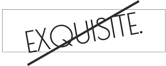
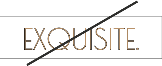
Poiret One is a unique and simple font that highlights the elegance of our brand. It is the only font to be used for our logo and cannot be used for body text or other headings.
To support our brand, we use Poppins, which is neutral and legible. This is our default font that we use for our texts, - apart from our logo - including our titles, hyperlinks, and body text.
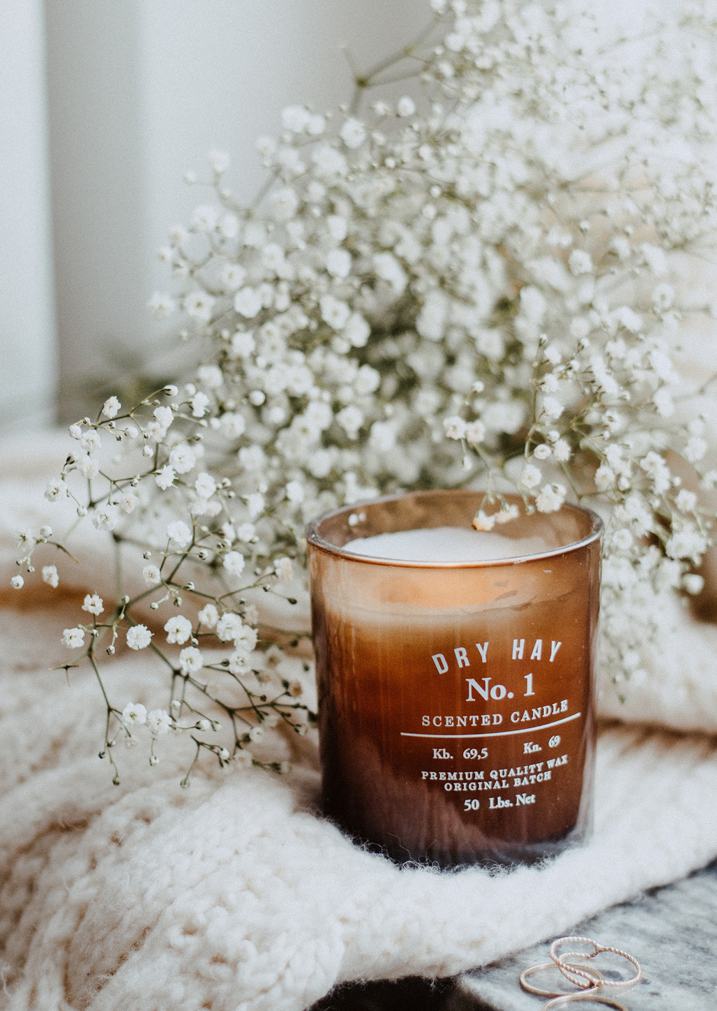
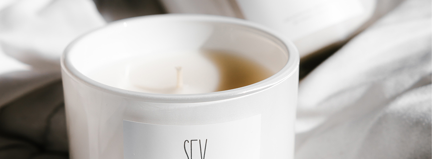
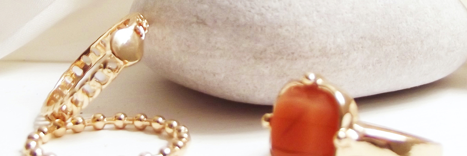
Here are the guidelines on what photos to use to support the brand:
Here, the copywriting is just a reflection of the values we embody so we want our voice to portray a warm, friendly, and welcoming message. In addition, we want to establish a relationship of trust with our customers so being reassuring and trustworthy is a must. Finally, because wellness is one of our core values, we want the writing style to promote a caring and calm voice. However, we know that elegance is at a premium with us and therefore it is essential that we do not use jargon on our platforms and instead use appropriate and professional language. .rt the brand:
Going into this project, I wanted to help solve the problem of current online stores offering too many choices, and so, focus on a narrow market area. In addition, I wanted to create a platform that was simple, minimalist, easy to use and suitable for elderly users. I think the challenge was met by blending usability with aesthetics.
Defining the brand guidelines proved to be a difficult task, as it involved coming up with an original idea and remaining cohesive with the brand through the interface design and the path it would take. Also, figuring out the branches and navigation paths was also complex, but rewarding at the end.
Next Steps...
I really enjoyed working on this personal project because it gave me an opportunity to be creative and develop a brand guidelines. Next step would be to focus more on the accessibility as I noticed some things could be improved. It would be great to develop more flows such as account creation or item payment, and provide a more interactive prototype.