

In the village of Nganda, as in many rural areas of Senegal, access to healthcare is limited. Community Health Workers (CHWs) therefore play an essential role: they raise awareness among families, guide them toward health facilities, and intervene on vital issues such as maternal and child health, nutrition, or the prevention of chronic diseases.
Traditionally, the Foundation for a Healthier Senegal (FOHSEN) organized in-person training sessions for CHWs. However, these sessions are costly (travel, accommodation, mobilizing trainers), infrequent, and do not allow CHWs to review or update their knowledge continuously.
The goal is to provide CHWs with a mobile learning application for continuous training, in order to strengthen their skills.
The project ambitions are as follows:

Image © FOHSEN. Used with permission for this UX/UI case study.
Before designing, I carried out a benchmark of e-learning applications (particularly in the medical and community fields). This allowed me to identify recurring design patterns:
These insights guided the definition of the first set of features.
We then conducted a questionnaire with 19 CHWs in Nganda to understand their practices and needs. These interview questions were designed to guide key design decisions regarding the community health workers’ learning preferences, language constraints, internet accessibility, and the type of technical support the application should provide. Understanding these elements helped ensure that the e-learning experience would be practical, inclusive, and aligned with the realities of their working environment. Here are a few questions we asked them :
To align the application with the most urgent needs of community health workers, I conducted a feature prioritization exercise using sticky notes on FigJam. This allowed me to categorize all potential features into two groups: essential elements for the MVP, secondary “nice-to-have” features and innovative features such as the AI option. This visual sorting helped clarify the scope, prevent feature overload, and ensure that the first version of the app remained simple, focused, and impactful.

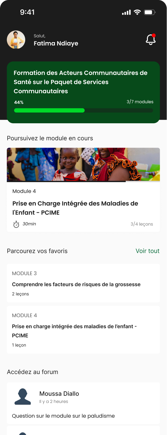
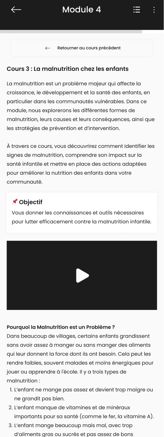
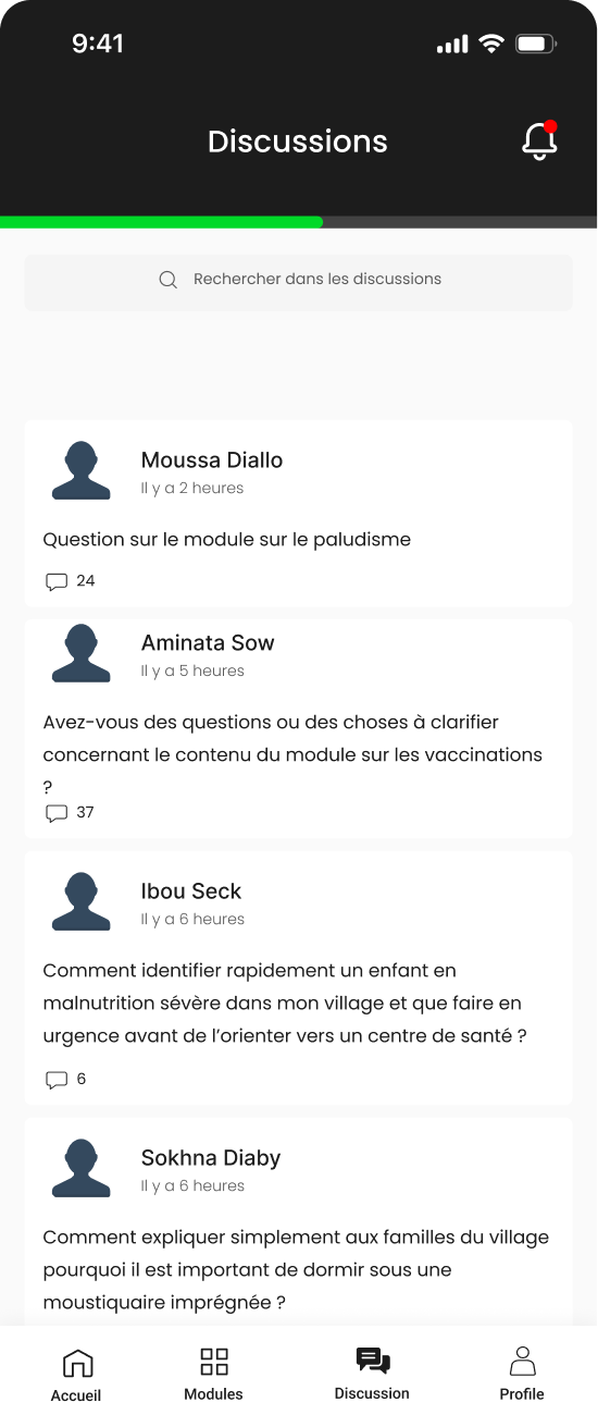
In co-creation with the FOHSEN team, we defined an MVP centered on three main features:
Instead of creating low-fidelity user flows and wireframes, I designed mid/high-fidelity wireframes directly. This was a strategic choice because CHWs have limited comfort with abstract interfaces. so screens close to the final product would facilitate understanding and testing.
Here are the first screens designed to be tested by the CHWs :
We conducted usability testing with 7 community health workers of varied profiles based on the criteria of ease with the French language and ease with mobile applications on a scale of high, medium and low ease. The candidates were required to complete 4 tasks :
The key insights from the user testing were that the app is perceived as useful and clear by most users. However, the success of the tasks depended strongly on the digital comfort level of CHWs. Tasks 1 and 2 were identified as the most challenging: accessing the training modules and opening the current module. To address this, we are considering simplifying the language by renaming “Module” to “Lesson,” updating the icon for better clarity, and increasing white space around the active module to make it stand out more. This will be complemented by a technical training component during rollout to ensure all CHWs can use the platform effectively.
After conducting the user testing, some minor changes have been made to improve readability of the content. After that, I designed the other screens like the profile page, modules list and the new discussion screen.
Currently, the app is ready to move into development for the first functionalities. Educational content is also still being produced.
The strategy for the next phase includes: