

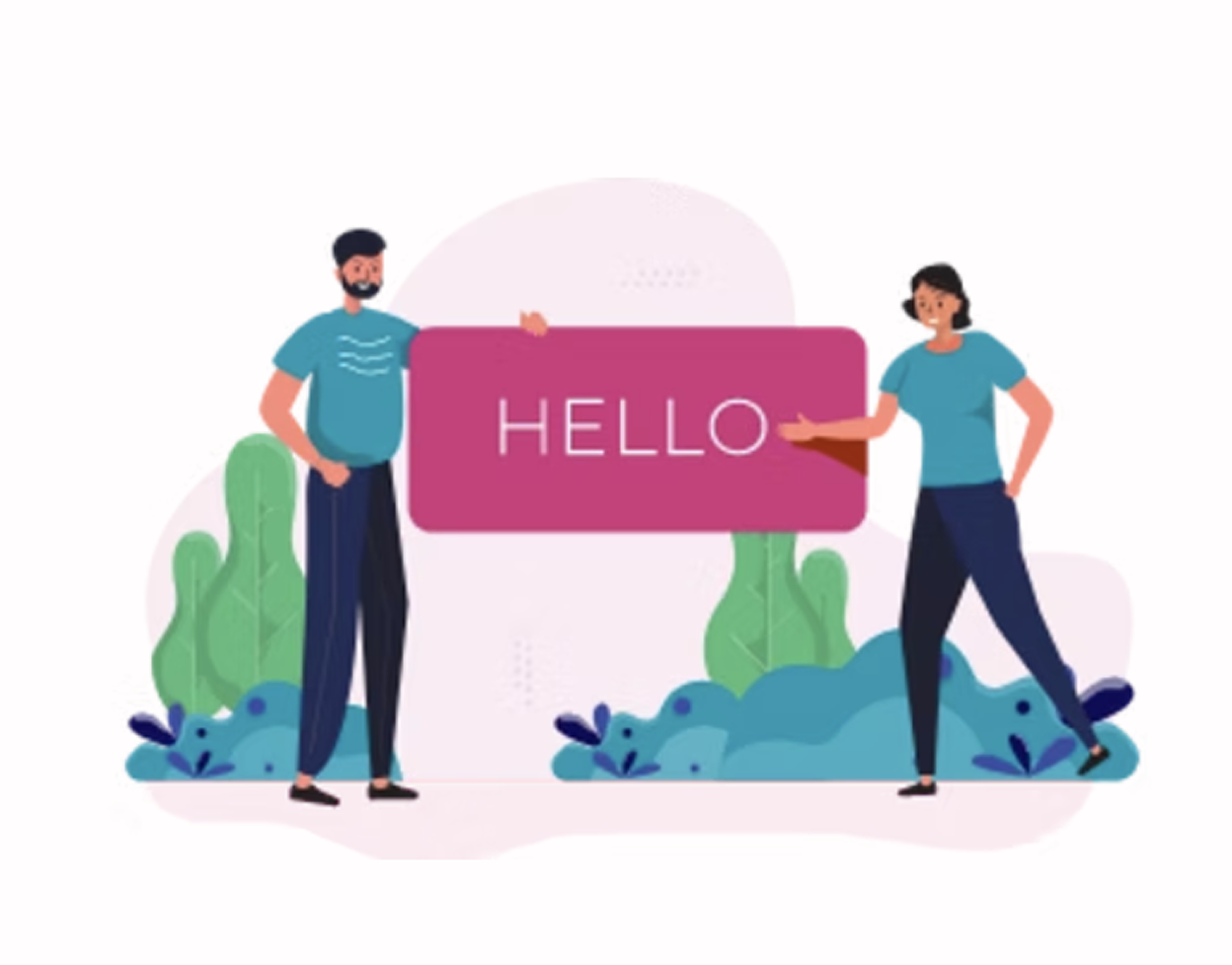
Liguey is a native app designed for Android and iOS that will allow users to search and apply for jobs. It is strongly inspired by the lack of apps to search for jobs in my home country. The current platforms are not optimal for users to find ads that match their profile. That's why I wanted to address this need by creating a platform that would allow users to find job ads in a fast and efficient way while providing a simple interface that would facilitate the process.
I conducted an intensive competitive analysis to figure out what were the pros and cons of the successful apps on the market and figure out where the opportunities were for my app. Here is-in a few points-the main things I got from that analysis:
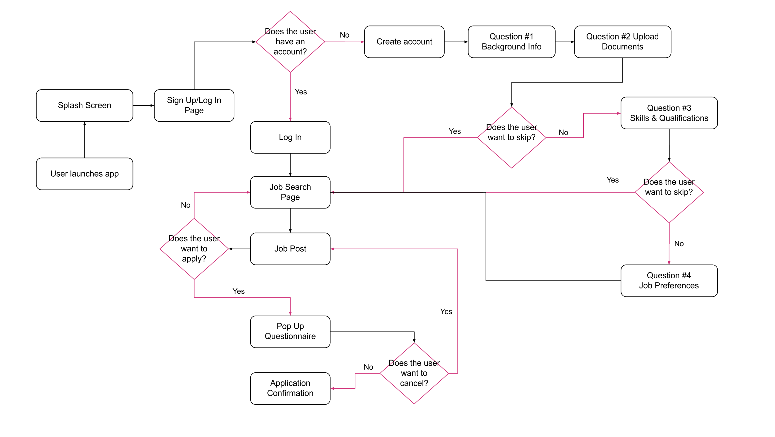
From the insights I gathered after conducting a competitive analysis, I developed a user flow diagram and low-fidelity diagram. The main flow is the one leading to the whole process of a job application.
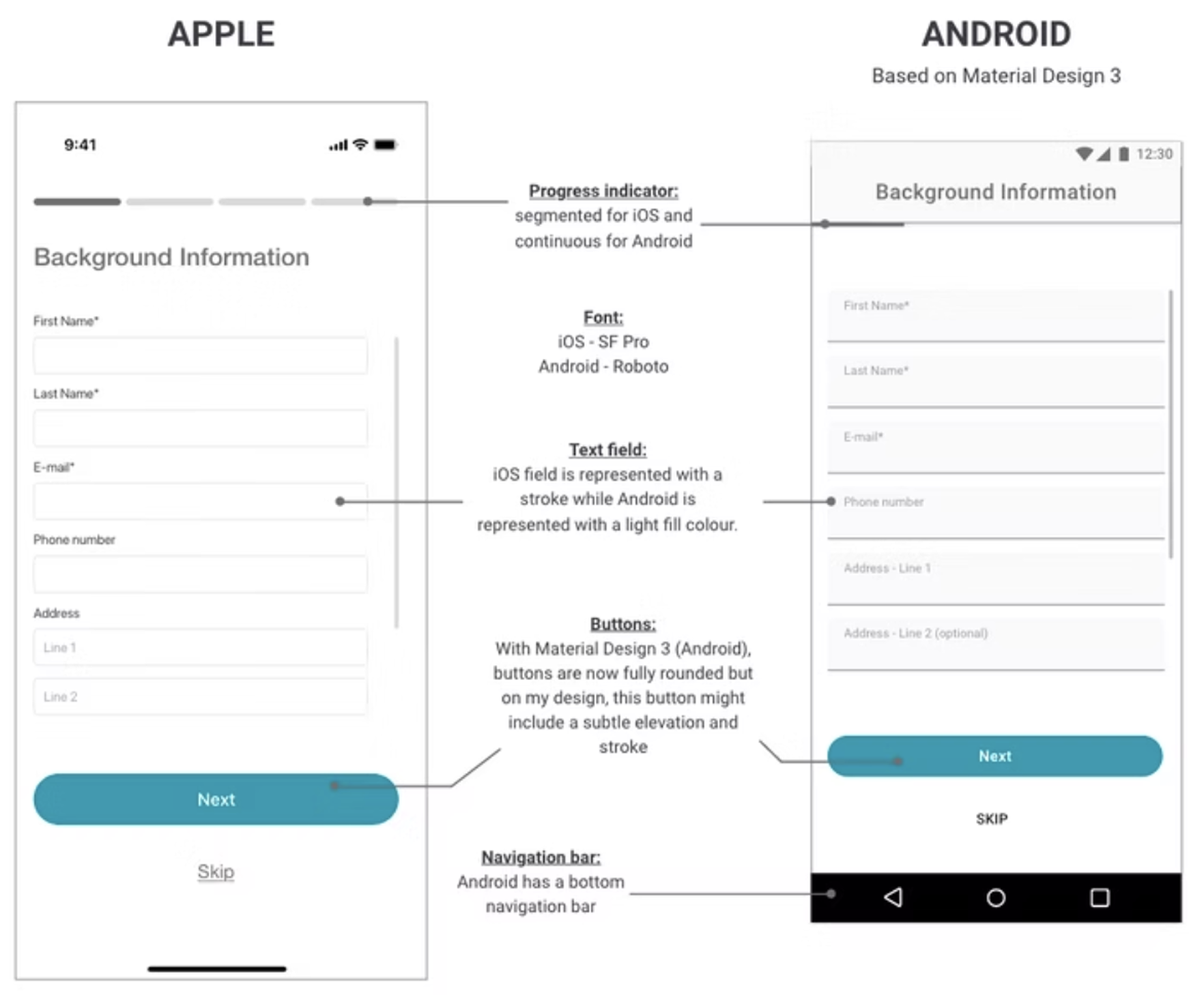
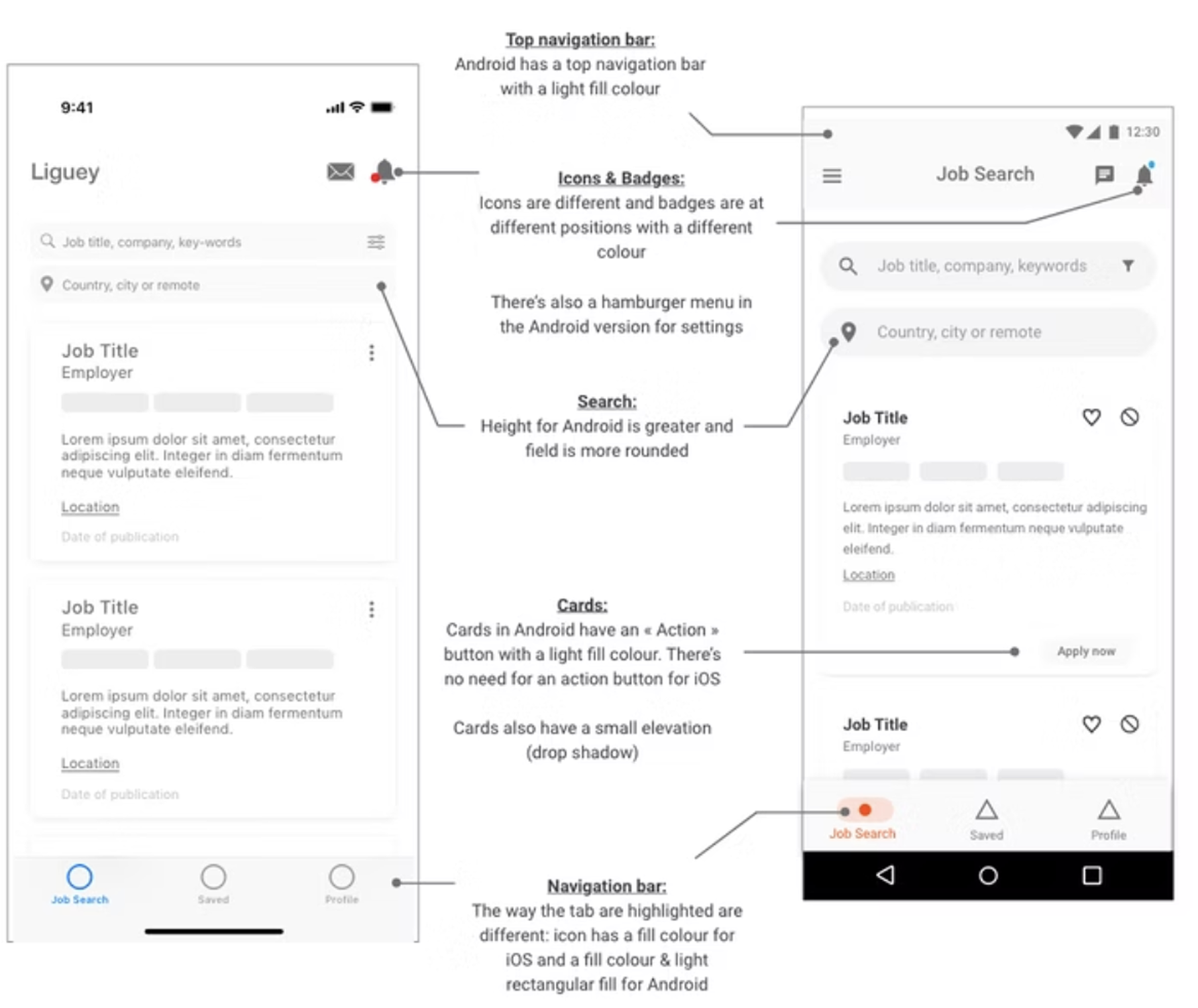
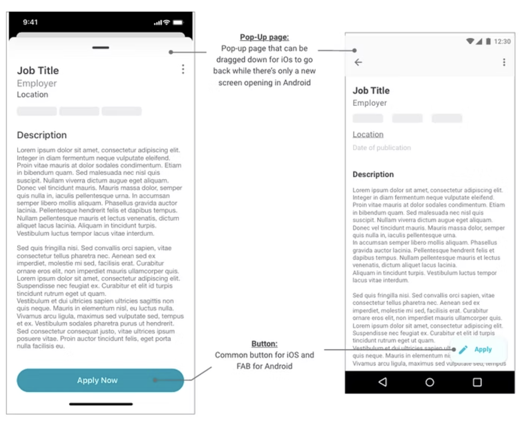
From reading the different design guidelines from iOS and Android, I managed to design the main differences for my screens.
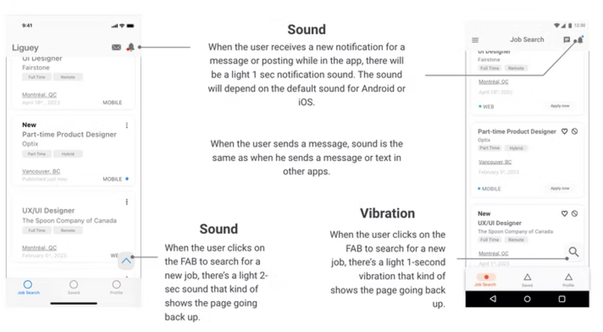
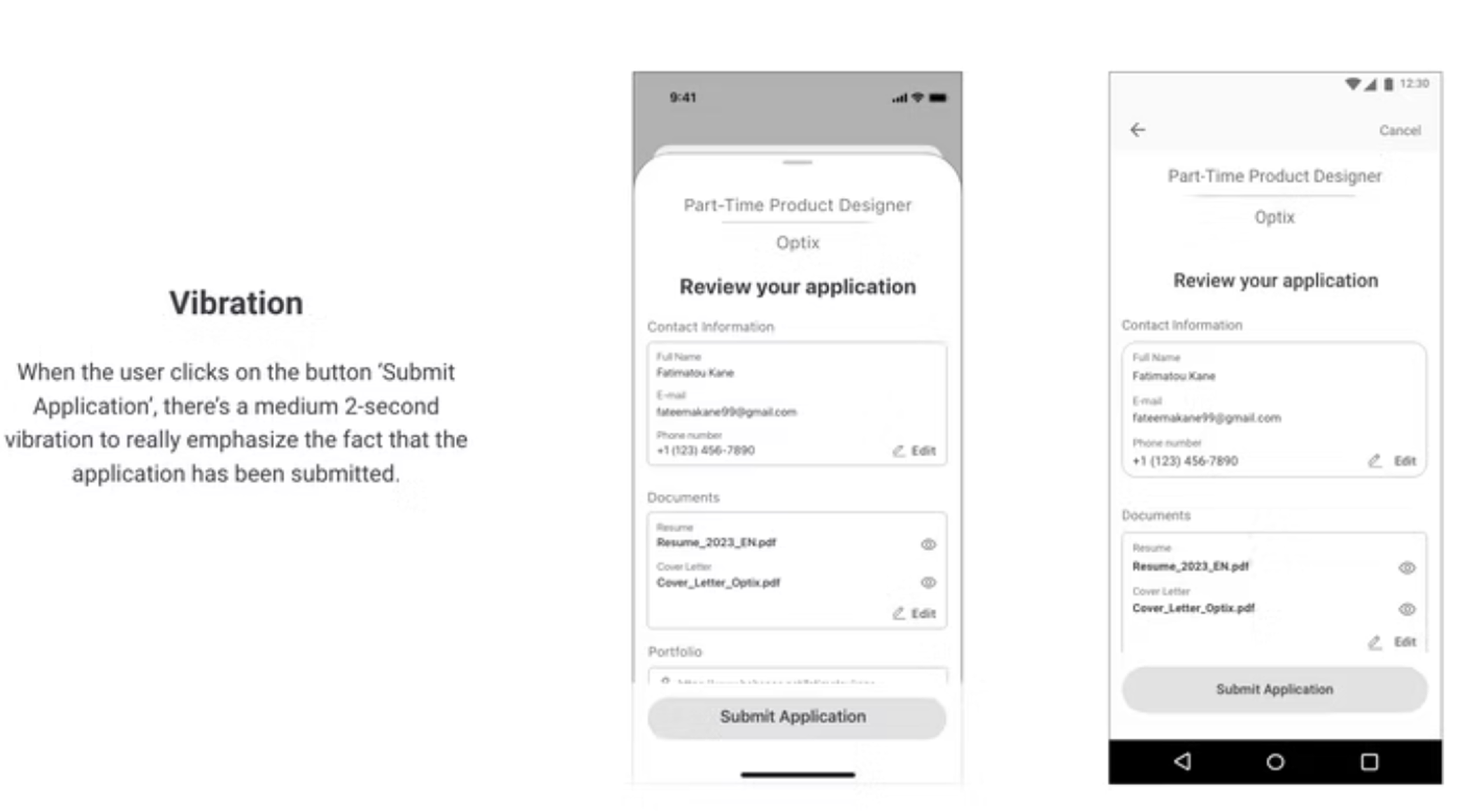
In order to support the interaction in the app, I have added sounds and haptic feedbacks throughout the app that met Material Design and iOS guidelines. Here are some examples of feedback to be featured in the app:
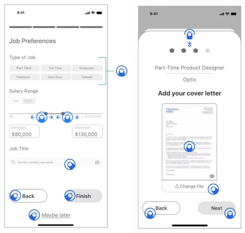
To take it further, I've indicated mobile gestures to be used throughout the app. An example is shown opposite:The major to be used in the app is "Tap". All buttons work using that gesture.
After designing the layout and patterns and using haptic and sound feedback to create interactions, I updated my designs froms mid to high fidelity wireframes for both iOS and Android versions while taking into account accessibility.
I did some user testing of my prototype with iOS and Android users to make sure my design met the needs. Based on the feedback I received, I fixed some errors in the prototype and improved the layout of some screens to make the platform more user-friendly. In general, testers were quite satisfied with the overall look of the native app for both versions.
This project gave me a first impression of what it is like to work with iOs and Android guidelines. So in the future, l'd like to continue to explore these guidelines to better familiarize myself and propose interfaces that meet the requirements of these platforms. Also, I really enjoyed learning more about animations so I would like to master this skill to develop more complex prototypes.